The rebound: How Covid-19 could lead to worse traffic
A rush to single occupancy vehicles could result in large travel time increases in transit heavy communities.
By: Yue Hu, Will Barbour, Samitha Samaranayake, Dan Work
Update 05/19/2020: Rebound travel time calculator. We have built our models into a calculator that considers user-defined scenarios of tranpsportation mode shift and models travel time impacts. The calculator makes predictions based on selected values for the degree of mode shift from transit and carpooling to SOV, and the decrease in number of commuters due to unemployment and remote work.
Select a city using the drop down menu in the calculator and mode shift values using the sliders. Models are based on data from the census-defined metropolitan statistical areas, which include areas outside a city’s urban core. Note that these one-way travel time predictions use a baseline of 2018 commute data from the American Community Survey; they are not corrected for 2020 pre-Covid conditions.
The sliders in the calculator change values in the following way:
- Transit shift to SOV: This is the percent of transit commuters who switch to single occupancy vehicles. At 0%, all transit users in the pre-covid setting return to transit. Setting this number to 25% means one in four transit users switch to single occupancy vehicle trips instead. Each transit commuter who switches to a single occupancy vehicle adds a vehicle to the road, increasing travel times. Increasing this number will increase travel times.
- Carpool shift to SOV: Similar to transit shift to SOV, this is the percent of carpool commuters who switch to single occupancy vehicles. Increasing this number will increase travel times.
- Jobs lost (%): This is the percent of commuters who no longer travel to work because they are unemployed. For example, setting this at 10% reduces the number of single occupancy vehicle trips by 10%, the number of transit riders by 10%, and so on. The job loss rates are assumed to be evenly lost across the traveling modes. Increasing this number will reduce travel times.
- Shift to remote work: This is the percent of commuters who no longer travel to work because they are working from home. Like the jobs lost slider, setting this slider at 10% the number of travelers by 10%, with the 10% reduction occurring for each mode. Increasing this number will reduce travel times.
For more details about how the calculator was created, see the remainder of the article below.
Update 05/18/2020: A scaling issue with the y-axis in Figures 1 and 6 was corrected; results did not change.
Update 05/14/2020: The latest numbers below account for changes to the definition of some Metropolitan Statistical Areas (MSA). Between 2012 and 2013, the geographic scope of several MSAs were redefined, resulting in a Year over Year population change of more than 5%. These cities include New York City, Austin, Charlotte, and Greenville. For these cities, the models have been re-calibrated using data after the MSA redefinition (i.e., 2013-2018).
Summary findings
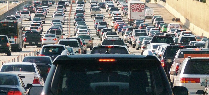
Traffic jams 101. Traffic jams result when there are more vehicles than the road network can handle. After the roads are fully saturated, the travel times increase with each additional traveler. In fact, the rate at which traffic grows follows a very predictable pattern.
Similarly, when there is a steep decrease in the number of travelers, traffic can vanish. The travel restrictions put in place to reduce the spread of Covid-19 resulted in a sharp reduction in traffic throughout the US.
As communities begin to reopen, it is important to understand how quickly traffic will rebound. Using basic laws of traffic, we can predict the amount of traffic that will occur in each city given only the number of vehicles on the road. This allows us to explore “what if” scenarios. For example, it is possible that many transit riders could switch to a car instead. We want to know how these decisions will impact traffic.
Main point. Cities that depend on transit are at risk for extreme traffic unless transit systems can resume safe, high throughput operations quickly. The cities most at risk include:
- San Francisco: 556,000 - 2,736,000 added traffic hours per day, or 20 - 80 minutes per person.
- New York: 1,203,000 - 5,845,000 added traffic hours per day (14 - 68 minutes per person).
- Los Angeles: 216,000 - 862,000 added traffic hours per day (2 - 10 minutes per person).
- Boston: 170,000 - 776,000 added traffic hours per day (6 - 22 minutes per person).
- Chicago: 146,000 - 662,000 added traffic hours per day (2 - 10 minutes per person).
- Seattle: 132,000 - 554,000 added traffic hours per day (6 - 20 minutes per person).
- San Jose: 74,000 - 240,000 added traffic hours per day (6 - 16 minutes per person).
The plot below gives a more detailed look at the consequences of shifts away from transit. We assume people quickly return to their regular commutes, but transit and carpool users do not. In one scenario, we assume 1 in 4 transit & carpool commuters take a personal vehicle. In another scenario, we assume 3 in 4 transit & carpool commuters take a personal vehicle. For cities that are already congested and that depend on transit, the impacts could be dramatic.
With just 1 in 4 transit & carpool commuters driving alone, San Francisco could see a one-way travel time increase of 10 minutes per person; New York, Boston, and Seattle could all see 10-minute increases if 3 in 4 transit & carpool commuters switch.
These potential increases are avoidable. If transit ridership returns in step with trips by car, road traffic will return to normal. Monitoring closely road and transit ridership during the rebound is critical.
In the remainder of this article, we will:
- Introduce the data on traffic in US cities
- Explain how to model traffic trends in these cities
- Use the model to forecast traffic in different reopening scenarios
Data analysis
In order to understand traffic in cities, we explore travel data from the American Community Survey (ACS) from the United States Census Bureau (USCB). Using this data, we can answer questions like:
- How many cars are on the road in each city?
- What is the average travel time [1] experienced by commuters in each city?
This publically available data is reported annually, and most metropolitan statistical areas have data from 2010-2018 [2]. We automatically downloaded it via Julien Leider’s "censusdata" Python package.
Determining the number of cars on the road is a straightforward calculation. The American Community Survey details the number of commuters in single occupancy vehicles (i.e., 1 car per person); the number of 2-person carpools, 3-person carpools, etc.
Once the number of vehicles are determined, we can begin to compare cities. The plot below shows the one-way travel time and the number of vehicles for most major cities in the US in 2018, which is the most recent data that is available.
Not surprisingly, cities with a large number of vehicles tend to have higher travel times. But the trends are not obvious, since the travel time in each city depends on a number of factors, such as the size of the city, the population density, the average distance traveled, etc.
To better understand the travel times, we can look at the behavior of individual cities. It turns out that for many cities, travel times follow a regular pattern known as the BPR model. The plots below show the number of cars on the road compared to the average one-way travel time within a single city. The travel times predicted by the BPR model are also shown.
The BPR model was originally designed to relate the travel times on a single road, but can also be applied to cities. The important point about the model is it captures common sense. When the roads are not completely packed, travel times are low. But after the number of cars is larger than a certain amount, travel times can skyrocket.
When applied to each city, the BPR model allows us to estimate two important numbers:
- Empty-road travel time: This is the average travel time commuters experience if the roads are virtually empty and free of traffic.
- Road capacity: This is the number of cars the city can handle before travel times quickly rise.
Once we know the empty road travel time and the road capacity for each city, we can standardize each city and compare them again. Instead of plotting travel times against the number of vehicles, we will instead look at:
- Travel time ratio: A travel time ratio of 1.1 means the current travel time is 1.1 times (or 10% higher) than the empty road travel time. Similarly, a travel time ratio of 1.5 means the current travel time is 1.5 times (50% higher) then the empty road travel time.
- Capacity ratio: A capacity ratio of 1.1 means there are 10% more cars than the road capacity. A capacity ratio of 0.9 means there are 10% fewer cars than the road capacity, and so on.
When we plot the cities and compare the travel time ratios with the capacity ratio, we see that all of the cities follow the same growing curve. This is the same data from Figure 2 above, just standardized to account for the fact that larger cities tend to have larger capacities and longer commutes, even when the roads are empty.
The fact that the cities fall on a nice curve means traffic is predictable [3].
Traffic scenarios during the rebound
We now explore what could happen if commuters quickly return to the roads, and transit users switch to cars instead.
We consider four scenarios [4]:
- 1 in 4 transit users drive instead
- 2 in 4 transit users drive instead
- 3 in 4 transit users drive instead
- all transit users drive instead
The scenarios are created to show a range of possibilities. The actual rate at which transit users shift to personal vehicles will depend on a multitude of factors that are specific to each traveler and each city. The point is that we can identify which cities are the most sensitive to changes in the number of cars on the road.
Two factors determine if travel times will significantly increase:
- Cities that historically have high capacity ratios (many more cars than the network can handle) are naturally sensitive to changes in the number of cars on the road. Even small changes can have big impacts.
- Cities that historically have lower capacity ratios can also see travel time impacts if the number of cars on the road increases enough. A large change will cause the travel times to increase substantially as well.
We can see the one-way travel time predictions for each city under each scenario in the following table and plot:
The table and plot have a lot of information in them, so it can help to visualize it in multiple ways. The plot below summarizes the same information but makes it easier to see what cities are most impacted.
Generally, we see that the increases are more severe for larger cities, and those that are more dependent on transit -- 8 of 10 cities with the largest predicted travel time increase also rank in the top 10 for transit use. The most extreme scenario (when all riders switch) is extremely unlikely. But it does illustrate that keeping transit open, safe, and available will be important to control the traffic rebound.
In the less extreme scenarios, we see that average travel times can increase by a few minutes. This might not seem like much, but it is. The additional delay is for each trip. When multiplied by the number of travelers in these cities, even a minute of delay per traveler can easily result in thousands of hours of additional time spent in traffic every day.
A few take home messages
- When the roads are already saturated, adding cars is detrimental to everyone’s commute. This is a basic law of traffic.
- Covid-19 cleared the streets in many communities. As we reopen, traffic will eventually rebound. If transit ridership does not return, travel times will increase, sometimes dramatically.
- Travel time increases of 5-10 minutes (one-way) are possible in high-transit cities, which adds up to hundreds of thousands of hours of additional travel time each day.
- These increases are avoidable, if transit ridership resumes in step with car traffic.
Notes
[1]The travel times are average over the population and the day. This means people traveling during rush hours have longer commutes, and people traveling off peak have shorter ones.
[2]The data is from 2018. It is the most current data we have. The travel times were probably higher in 2019.
[3]Many, but not all cities follow the law! Some cities do not have enough variation in the census data for us to accurately determine how they behave. More details on methods and technical approaches coming next.
[4]These scenarios do not consider offsetting factors. For example, we may see fewer vehicles on the road due to high unemployment, remote work, etc. If we know these numbers, we can make more accurate predictions.
Research team (contact us)
- Yue Hu is a PhD student at Vanderbilt University
- Will Barbour is a research scientist at Vanderbilt University
- Samitha Samaranayake is an assistant professor at Cornell University
- Dan Work is an associate professor at Vanderbilt University